Design
It seems that people write about design often. Many times the articles written sound like they take themselves a bit too seriously, implying that there are phychological impacts design has on our lives. I don't know that I would take it that far, but I do think we desire to make things more efficient, more noticeable and more pleasing to the eye. This is especially true when it comes to our businesses and hobbies. We want more people to notice what we are doing. It is just an instinctual phenomenon.
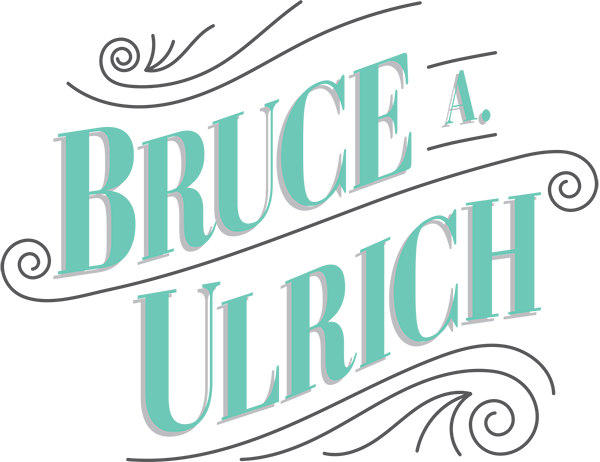
I recently elicited the help of my graphic designer friend, Alan, to help me redesign my logo and business card. I have had the same logo and business card for probably about 7 years now, and that is a long time to keep the same design. We agreed to barter.
I had already been collecting some design ideas, and storing them away for when this day would inevietably come. I knew it wsa only a matter of time. And it is a good thing I did, because we had quite a few looks to pull inspiration from.
I drew inspiration from different places. It seemed that no one card or logo that I saw was just what I was looking for, and it's a good thing, because that would be ripping them off. ha. One placed that I drew a ton of inspiration from was From Up North. It is kind of an aggregate of different typography things, all collected into one location.
It is a good idea, when you're starting to explore a new design, to collect examples of things you like, so that you can incorporate those parts into the new design. I'm not saying you should copy someone's design exactly, but rather just glean from different designs elements you like. Do you like the white space? Do you like the font? What about the font do you like? Does it have very narrow kerning (spacing between letters) or wide? Those are the kinds of things you have to explore, in order to land on the design you're most happy with.
Let me show you some examples of things that inspired me for this design:
I loved how fancy and detailed this one was. I knew I would not spend the money to do the debossing that you see here on this card (where some of the items are actually depressed into the card), but I still liked it a lot.
Some others, I chose simple for typeface design examples. I wasn't sure if I wanted a serif font or sans serif font. There are fonts in both categories I like. This is one I drew inspiration from. I liked the odd, triangular serifs on the letters.
Here's another one that had a similar swoop, but a little different font. The serif was very subtle, but still present. I liked this one as well. It looks very majestic.
This one was more of a scroll type of font, but I still liked it. I guess I considered it as more of a mix between cursive and print.
Then, there were some that were a great departure from my other typography styles listed above...like this one. It is just very different and eye-catching to me.
There were some other elements I pulled from, besides just typography styles. I liked how this card had a 2-color theme, and one side was the negative color of the other. I ended up mimicking this element on my business card, but just not using the same color.
I even considered patters in the background, like these next two. In the right circumstance and with the right color combinations, it can look very sharp.
And for the back of the card, I landed on a design based on this one, with a very nicely laid out typography arrangement.
Anyway, we had quite a few designs before I settled on the one I am using now. You've probably already seen the logo change, as I've been using it for months. I kept trying to write this blog post, and I just kept not having all of the pieces in one place to compose it properly.
Here is the final business card design:
(If you want to see the back, let me know. It has all of my info on it, so I just don't want to post it here.)
In the near future, the entire site will look a little different. I'm also going to be changing the design of the site some. I've had this template for over a year, and it seems to have some limitations that are a barrier to me posting more often. So look for those changes coming up very soon.
Let me know below what you think of the new logo design.
